
Rawson Atlantic Seaboard
Creative Direction & Brand System Development
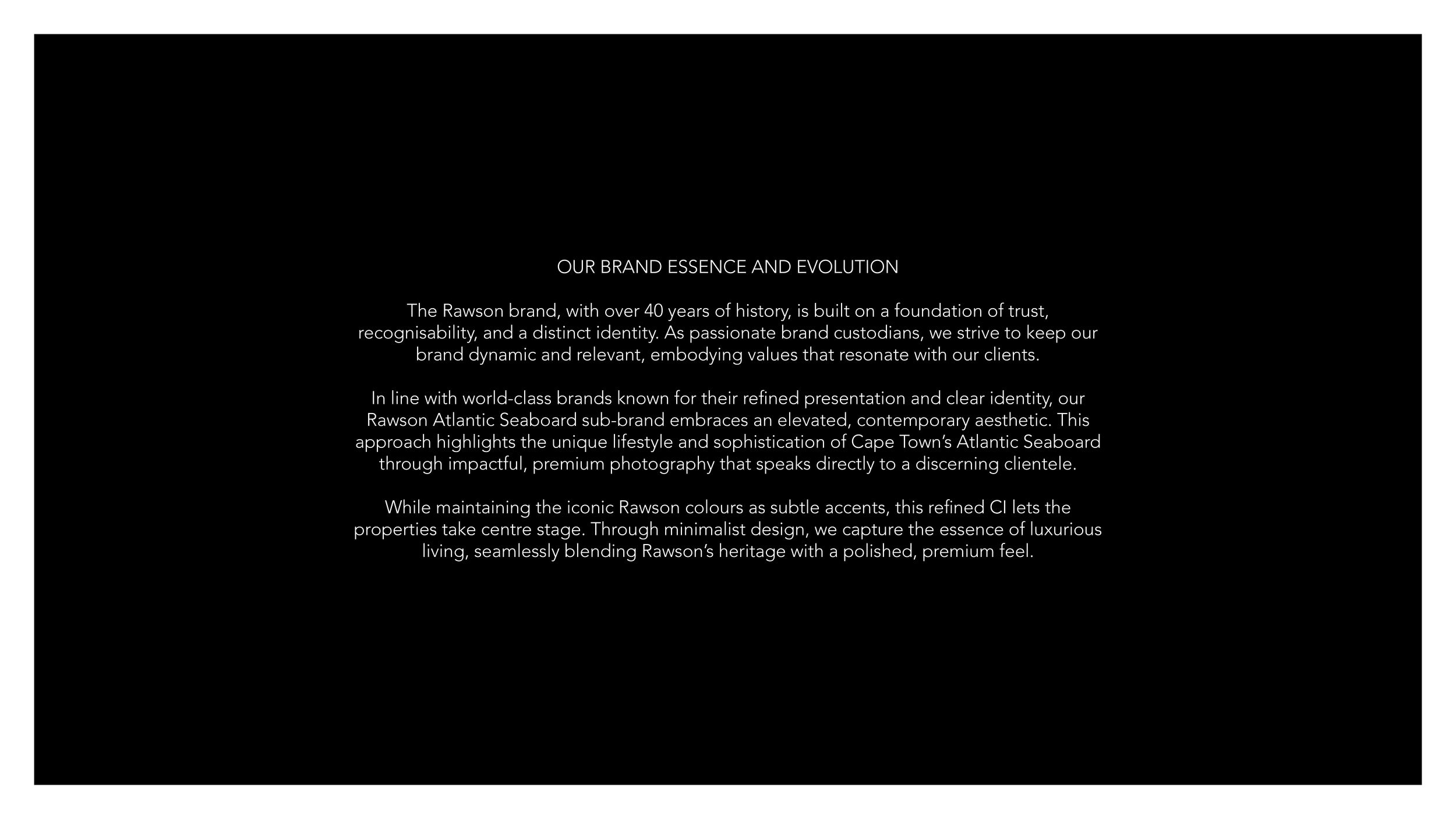
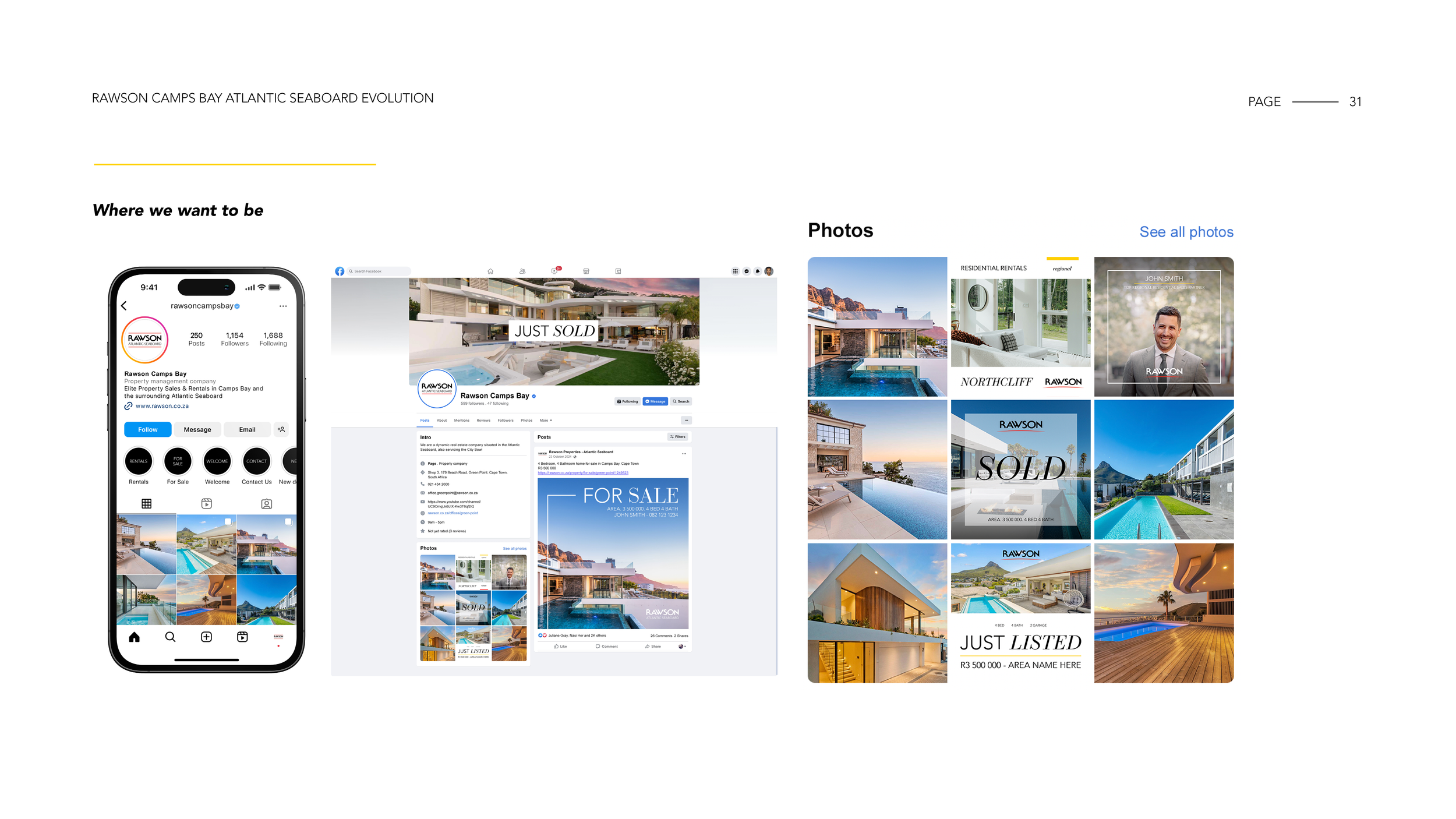
I led the rebrand of Rawson Atlantic Seaboard, repositioning the business to appeal to a more high-net-worth audience while differentiating it from the broader Rawson identity.
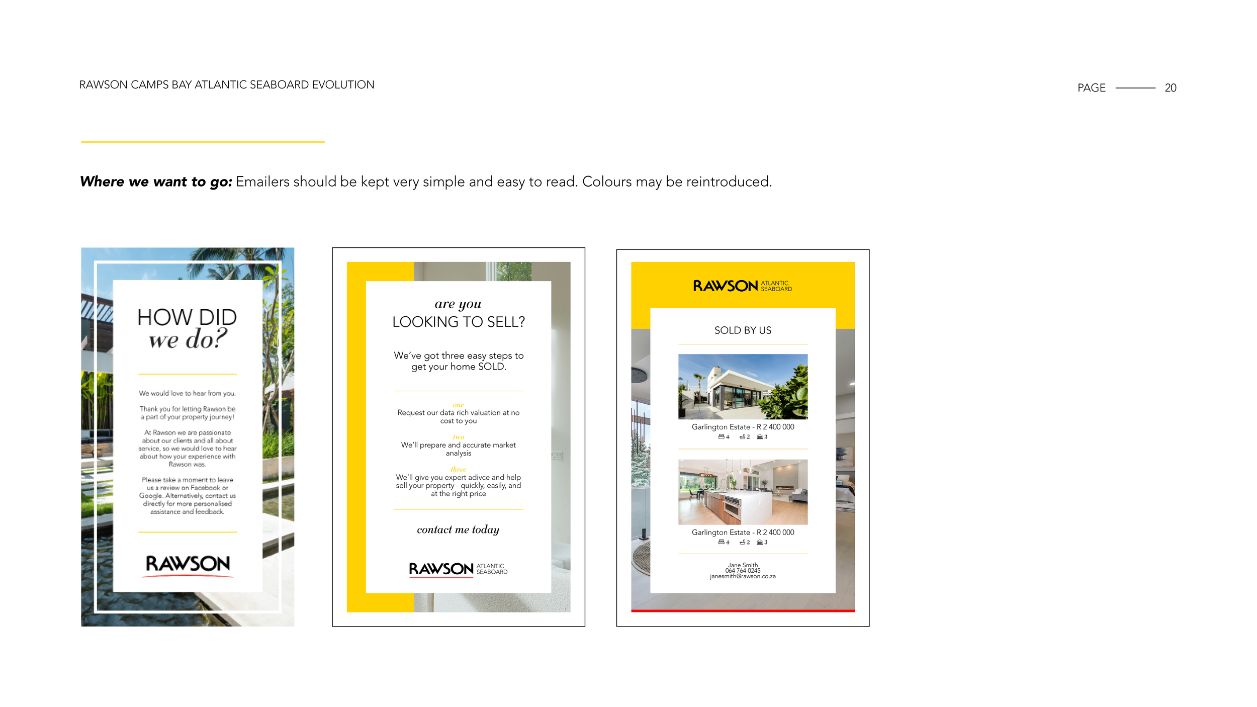
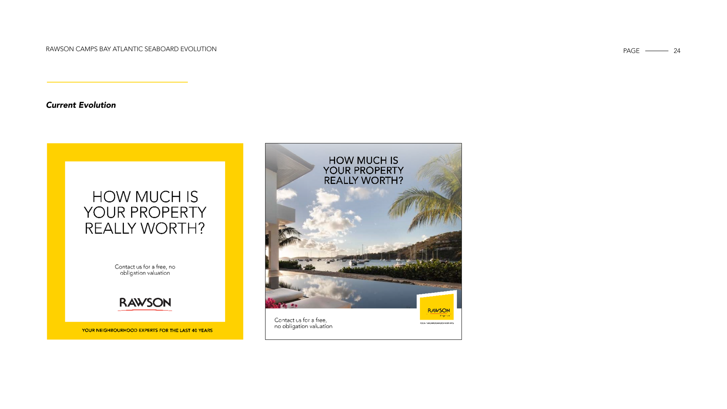
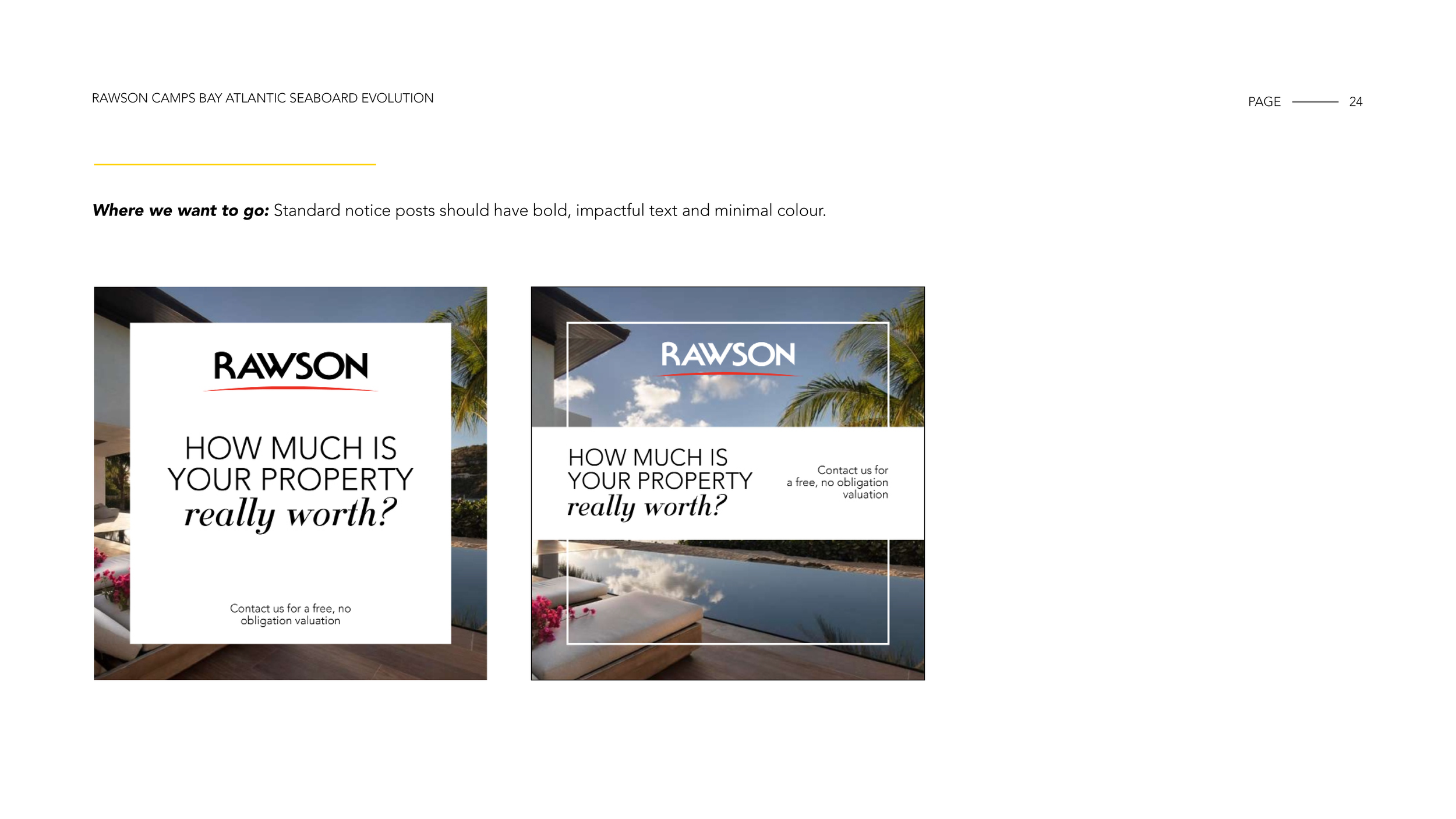
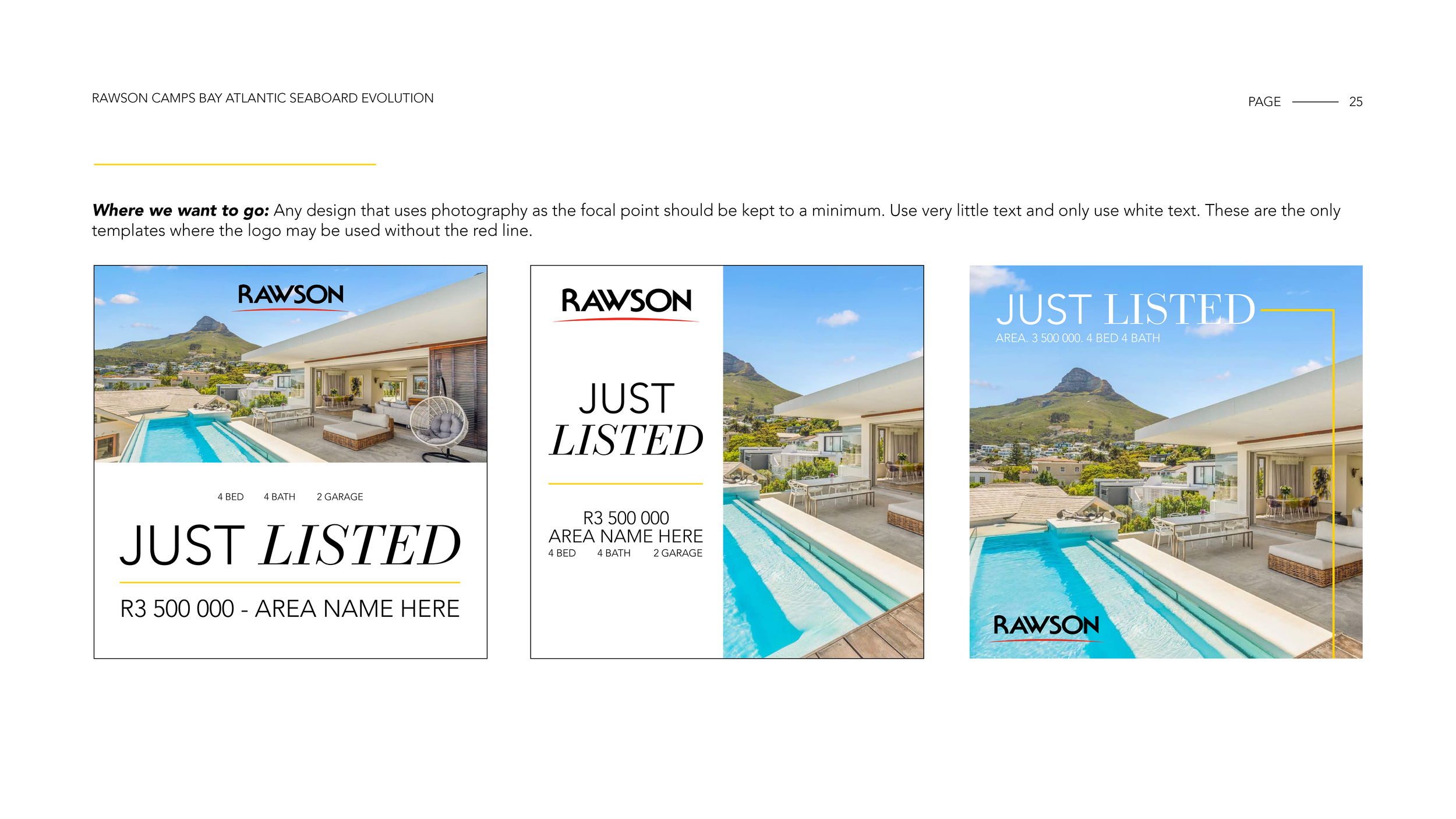
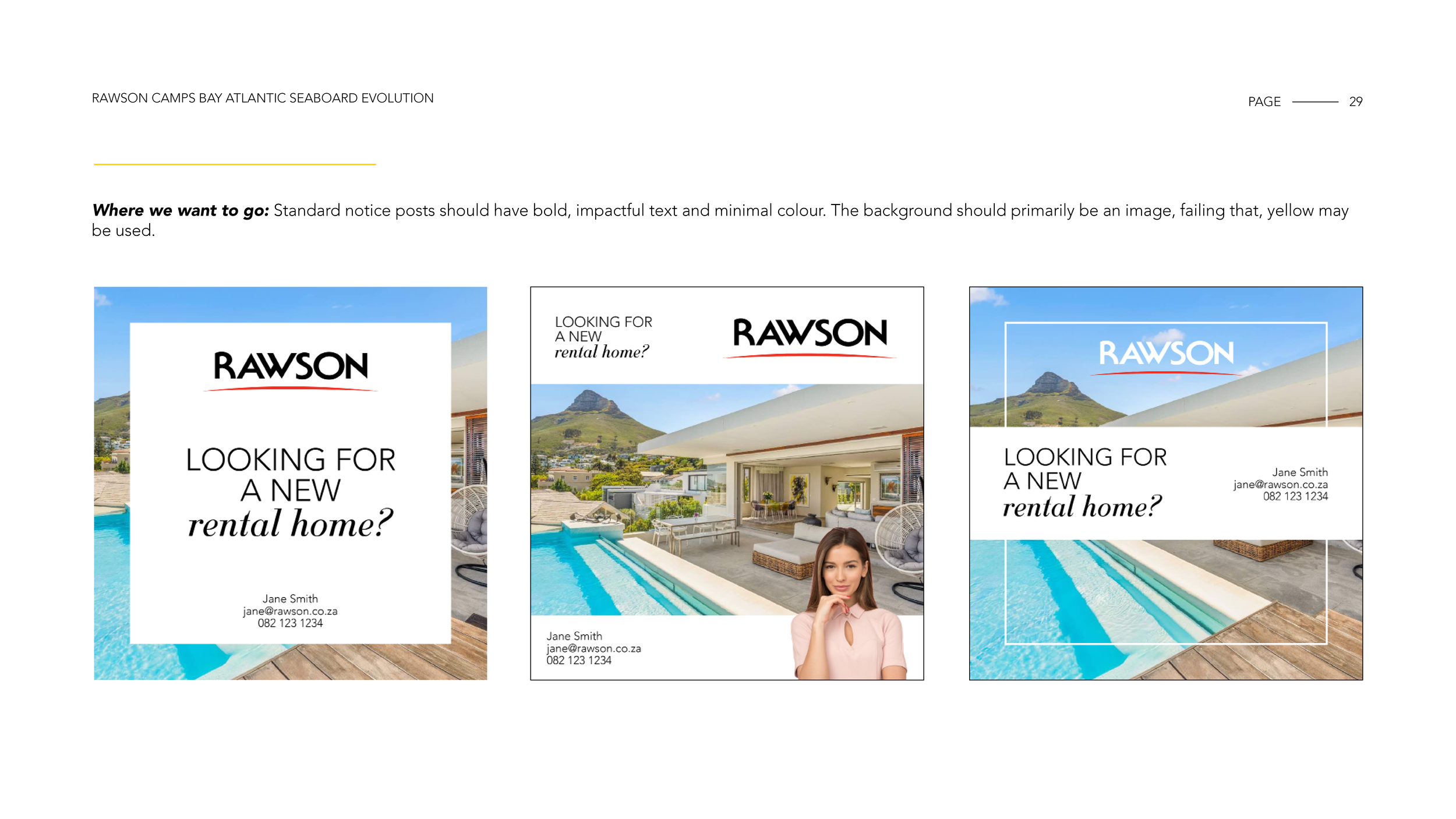
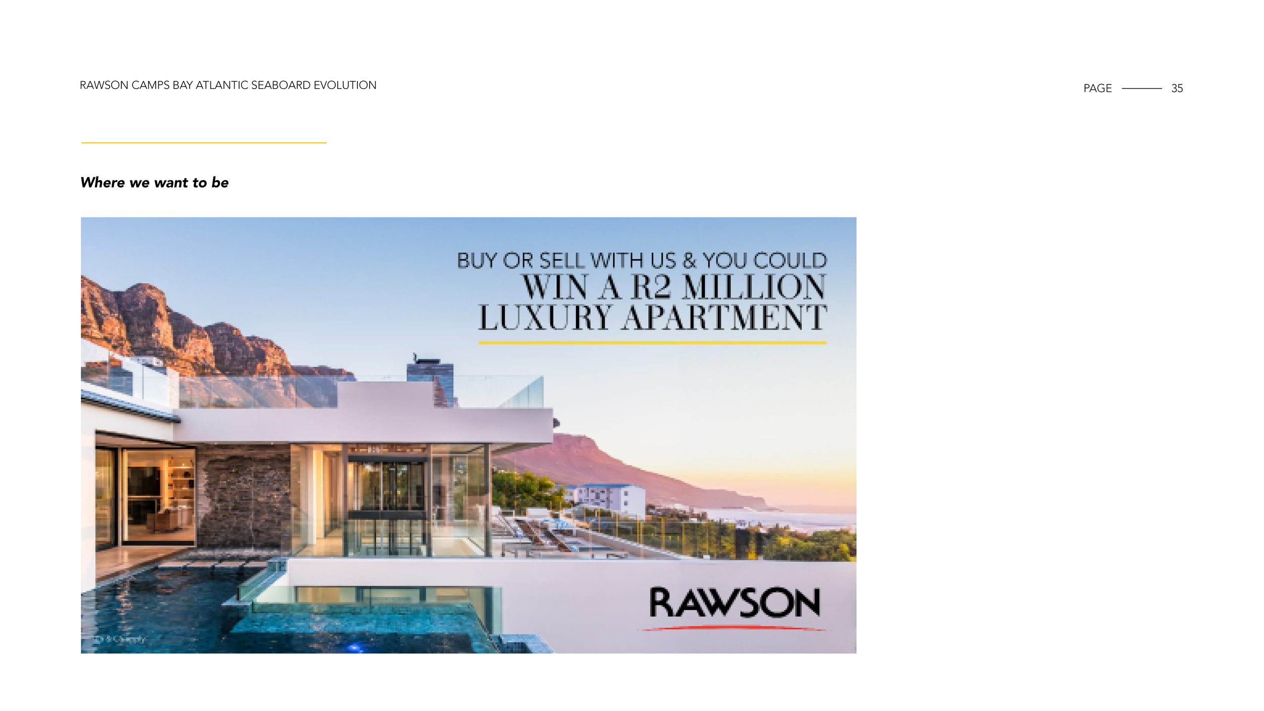
The objective was to move away from a traditional real estate look and feel and establish a more refined, editorial aesthetic aligned with the premium Atlantic Seaboard market. The rebrand focused on restraint, high-impact photography and a cleaner digital presence to better reflect the calibre of properties being marketed.
Approach
I shifted the visual language from bold, sales-driven graphics to a more minimal, design-led system:
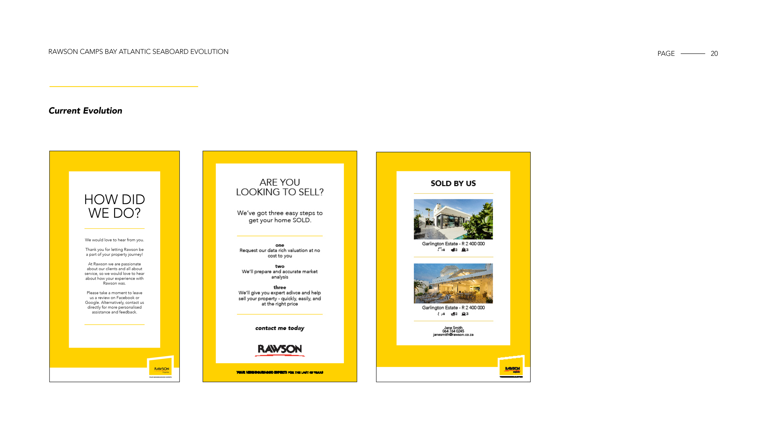
Reduced reliance on yellow as a primary colour, using it instead as a controlled accent
Introduced a photography-first approach, allowing properties to lead the narrative
Established a calm, editorial layout style inspired by luxury lifestyle publishing
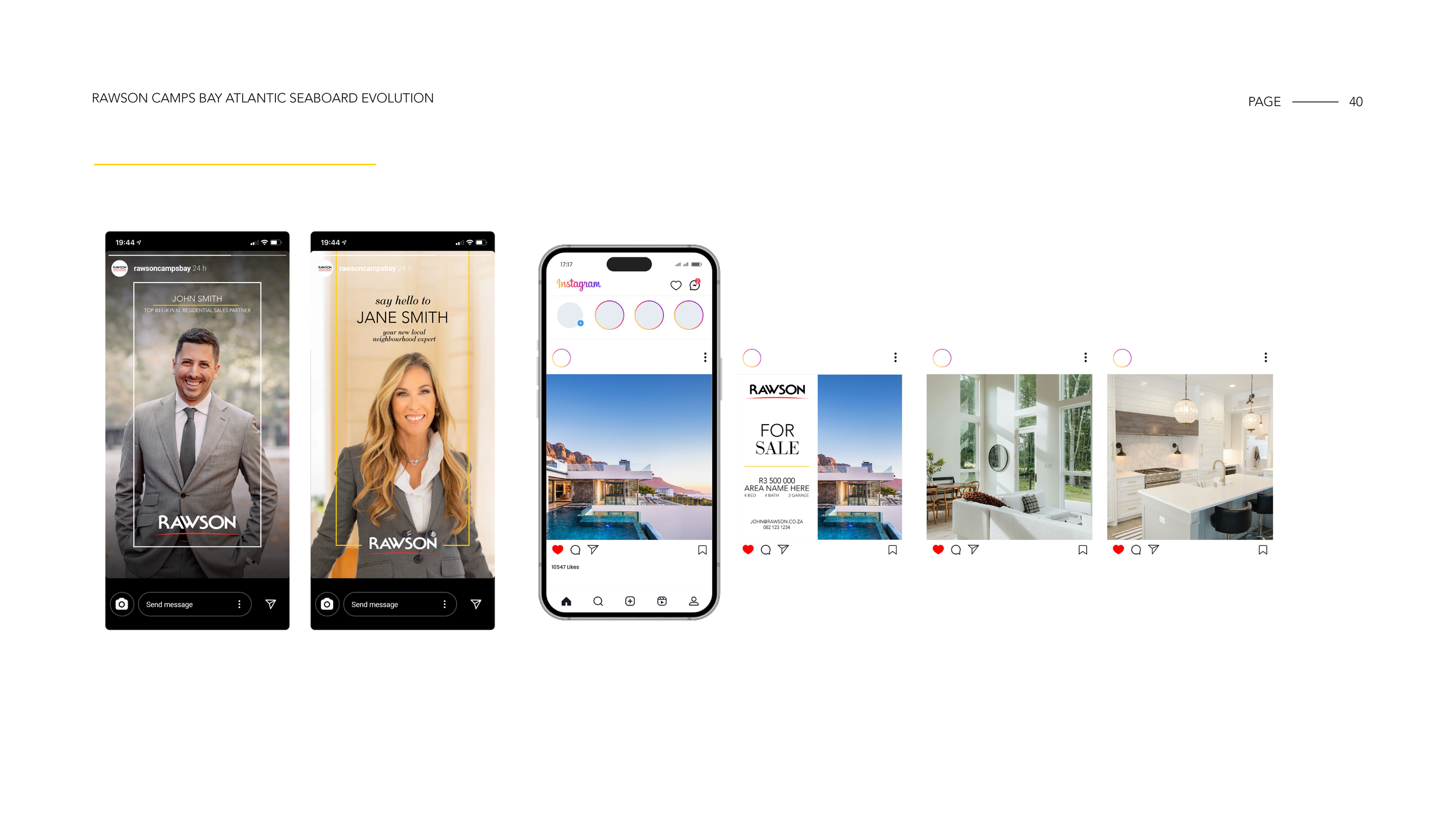
Designed social templates that prioritised imagery over text-heavy communication
Execution
I developed the practical tools to roll the rebrand out consistently across channels:
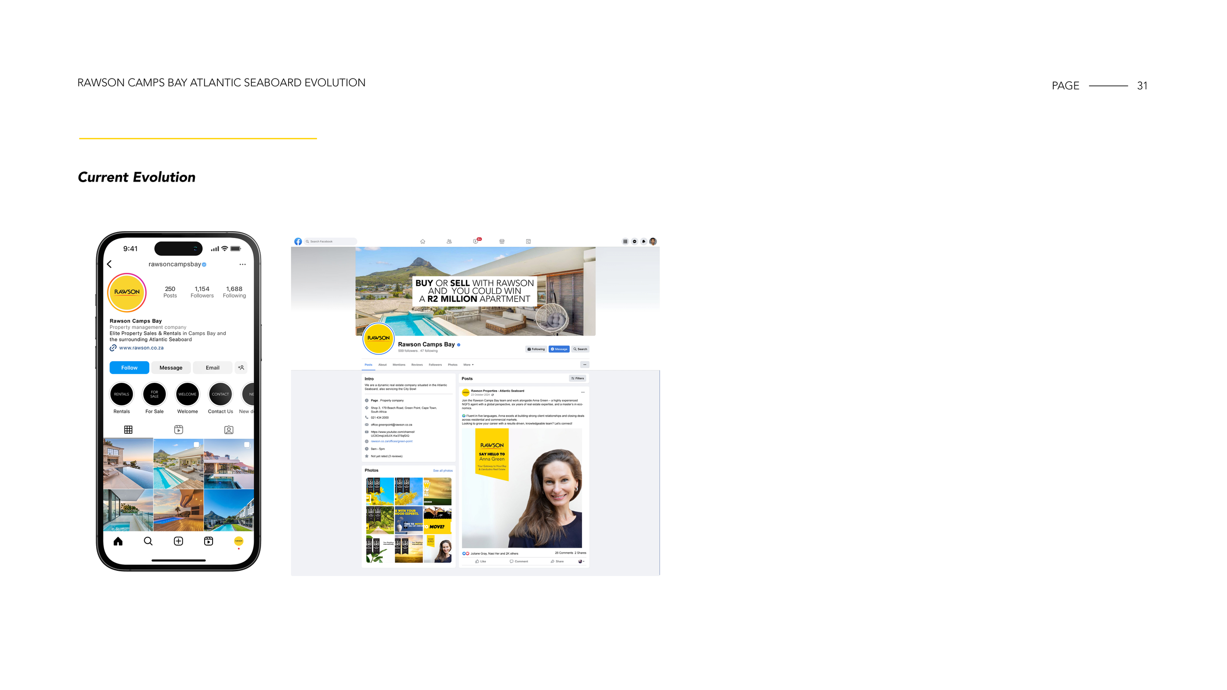
Social media framework where the Instagram grid showcases property imagery only, with messaging moved into carousels
Photography direction to ensure sufficient negative space for branding and a more considered composition
Retouching guidelines to remove visual distractions and maintain a premium feel
Updated templates, visual standards and supplier briefs to align all outputs to the new positioning